

What’s wrong with this picture?
Just a short fun post here about some Design Dont’s. Can you tell What’s Wrong With This Picture? This looks like a lovely room but something is not quite right. Can you find it?

Can you tell what is wrong here? Image: Sidekicks media, Unsplash
HERE’S ANOTHER EXAMPLE
Can you tell what is wrong here?
There are a lot I like about these pictures but the carpet in both rooms is too small. I’d like to see the carpet under at least the front legs of the chair to make the chair part of the vignette. Right now it is visually outside the conversation grouping.

This rug is the correct size. Image: Shades of Light
AND THIS?

Can you tell what is not working here?
I think the carpet is too far under the console. It looks like when you walk by the end of the bed you would be walking on the edge of the carpet. I say move the carpet out and it will be more balanced.
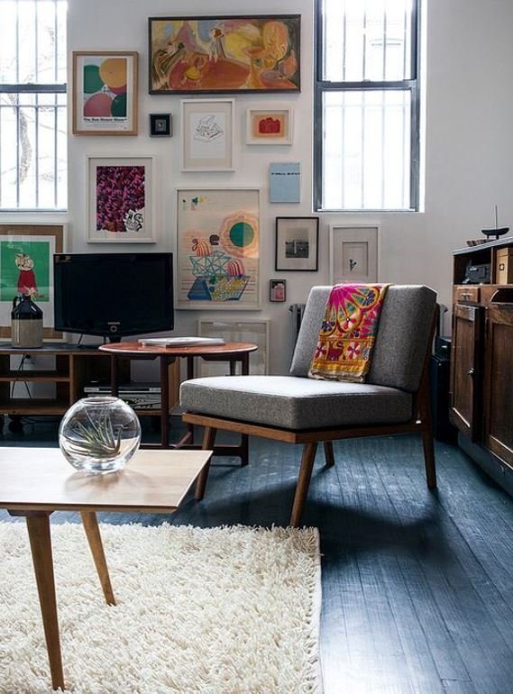
WHAT IS WRONG HERE?
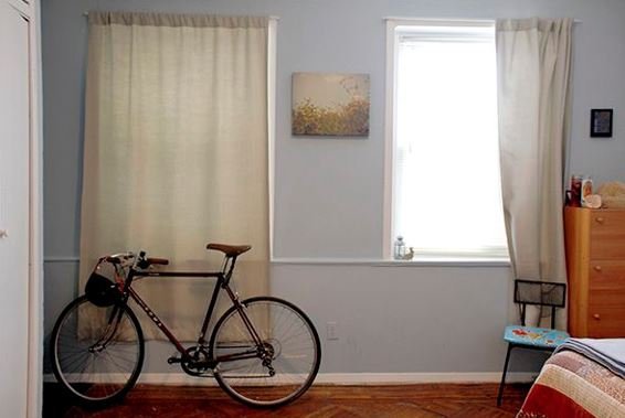
Using colour and textures to create the right feel, Image: Sandra Rei
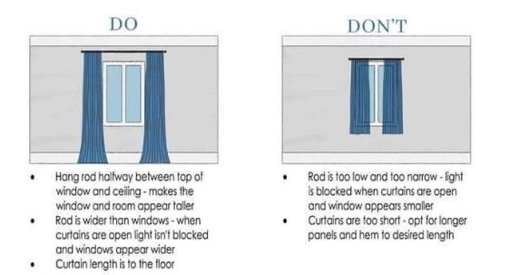
This is a good shot because it is a real life shot but what’s “wrong” about this image is that the curtains are too short. They should just skim the floor. Also, curtains are best hung above the frame of the window; ideal is halfway between the top of the window and the ceiling. There are times when this won’t work but it is a good guideline.
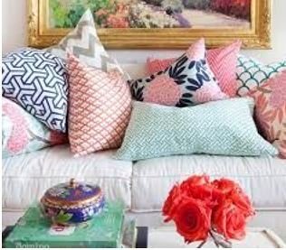
And finally, what’s wrong here?
There are just too many cushions here. Having a lot of cushions can make the styling look interesting but the reality is, if there are too many cushions on the sofa they will end up on the floor when people sit there OR no one will sit there. I like to add about three cushions to a sofa. It makes it interesting and comfortable.
How about sending us an image for our game? I am always on the hunt to find new images for this series.